Nomad Health Rebrand
Creating a Themeable Design System
When leadership chose to undergo a head-to-toe rebrand, we jumped at the opportunity to build a better design system from the ground up—one that would make our designers’ lives easier, ensure consistency across all projects, and be themeable for white-labeled solutions.

Background
When you have multiple designers working across several scrum teams, it’s important to have a shared design language and a library of components to draw from. A good design system improves production speed and quality, and keeps everyone in sync. With pre-made components, designers can focus on the actual user experience rather than recreating each component from scratch, and engineers can save time with implementation.
When I first joined Nomad, there was a legacy design library in place, but with so much recent turnover, there was no clear owner and no processes for updating the library. Additionally, Nomad comprised three separate platforms for different users (one for travel nurses looking for a job, one for our internal operations associates, and one for hospital facilities looking to fill jobs), and each were developed independently of one another. As you can probably guess, that meant each platform had a vastly different look and feel, and each one had its own divergent components.
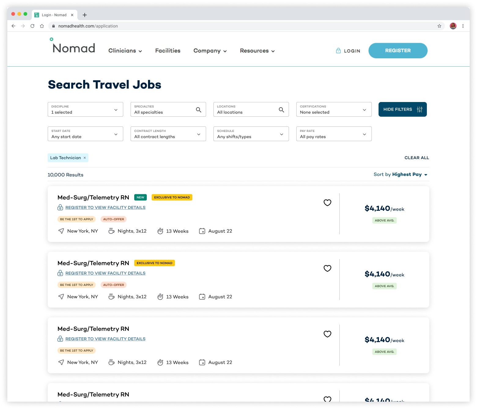
The main clinician-facing platform
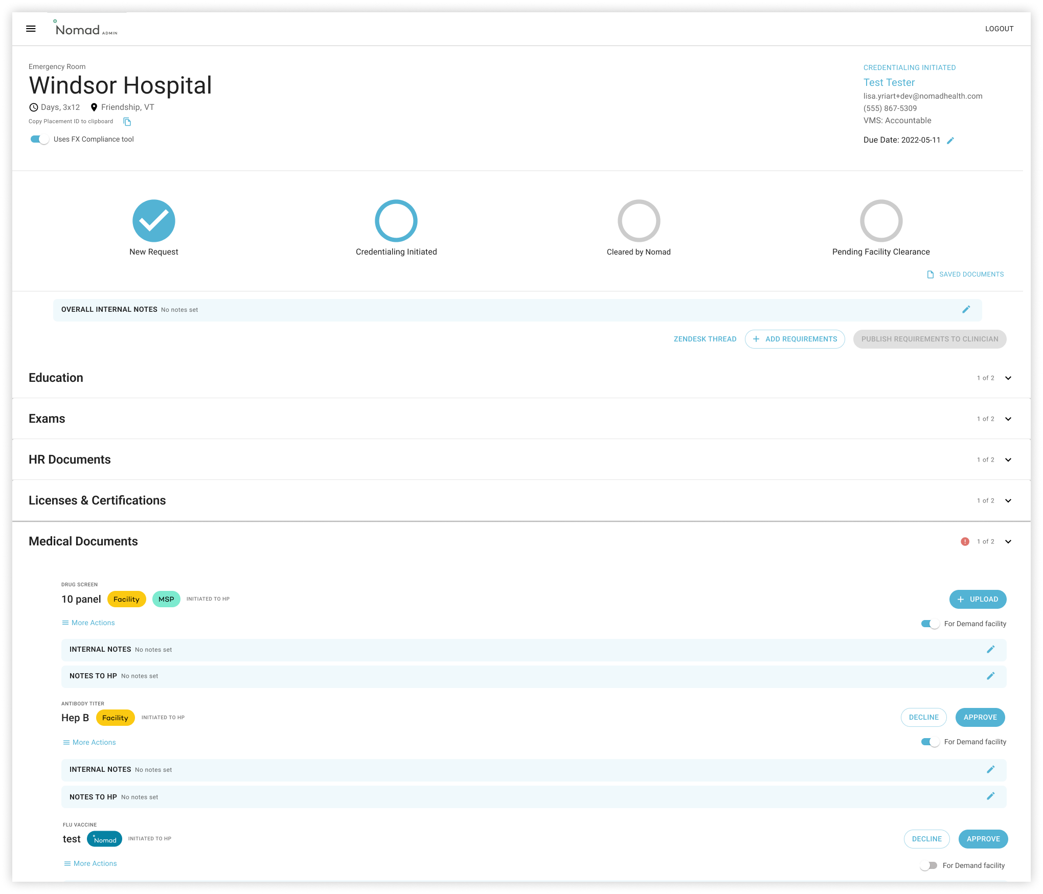
Our internal admin platform
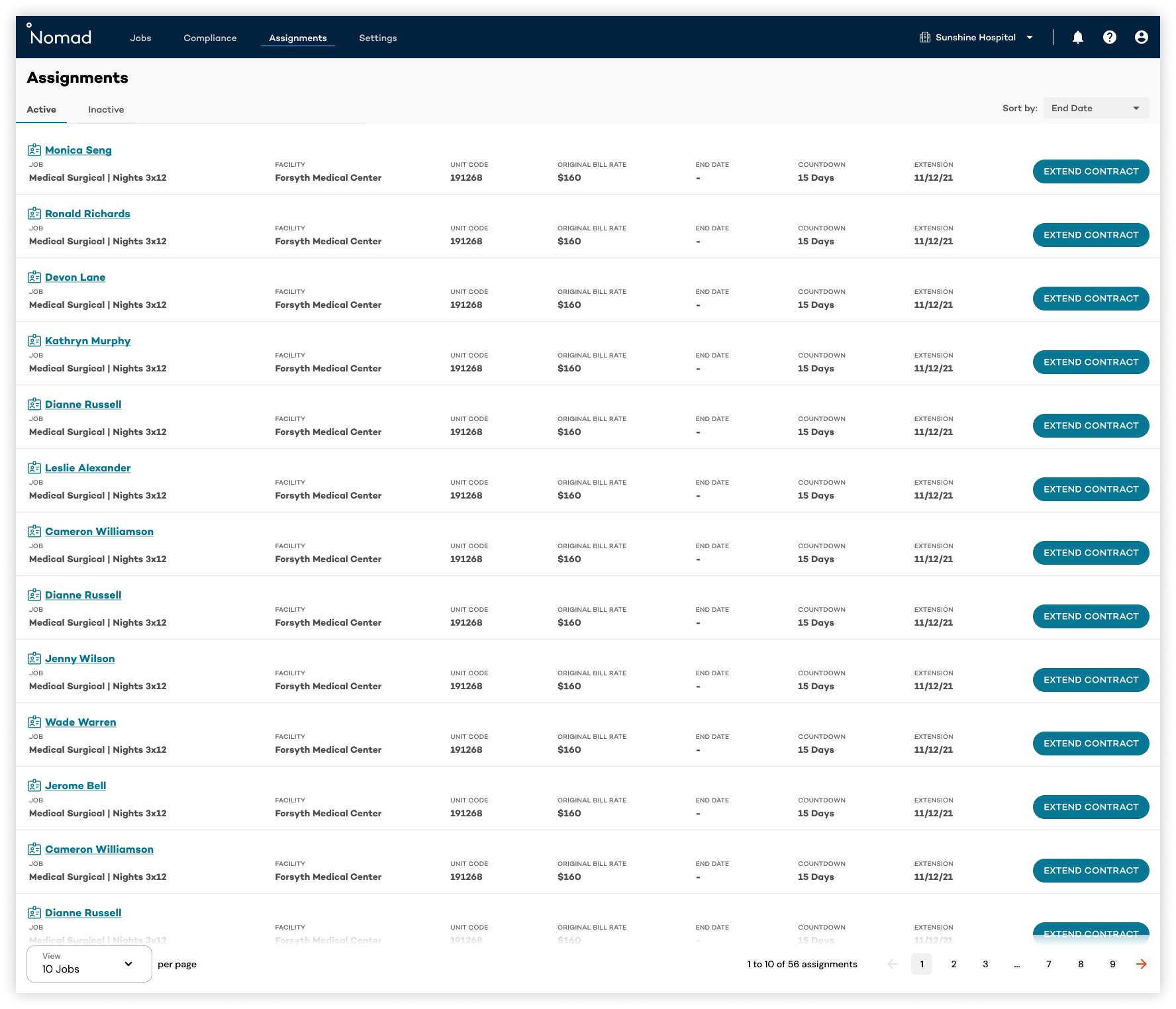
The hospital facility-facing platform
With the imminent rebrand, we saw an opportunity to start with a clean slate. We started by defining our ideal design system:
A single source of truth for styles and components
Shared components across all of Nomad’s three platforms (e.g., using the same style of form field or buttons for all platforms)
Accessibility - WCAG 2.1 Level AA compliance
Complete parity between our Figma design library and the developers’ component library
A clear process for contributing to the design library in the future
Themeable components for future white-labeled solutions
Getting Organized
First, we had to take stock of all the styles in use across our three different platforms and consider the needs for each. We surveyed the designers, gathered all the variations of our components on one Figma page, and evaluated them. Some challenges we identified:
Frequently, due to time or engineering constraints, designers had had to create one-off components to compromise, so there was no single source of truth.
We had icons from different sources throughout the years, leading to inconsistent sizing, weight, style, etc.
Our platforms used different UI libraries (e.g. React Boostrap, MUI), and some components were dependent on each platform and not re-useable.
While we had our hands full with untangling the mess of our current design system, we also had to think about what was needed for the rebrand process. Company leadership had contracted with an external agency to determine the direction of the new brand, but we had no idea what assets or brand guidelines we were going to receive in January 2023 for an expected September 2023 launch. We created a rough plan for implementation once we received the assets:
Experiment with the assets to land on the right look and feel for the new brand tone. Determine what brand colors should be primary, secondary, etc. Set up a typography hierarchy.
Start creating components that adhere to the new design language. Have designers test them out in current projects.
Work with the lead engineer to create a framework for implementing components.
Creating A New Design System
Foundations
We decided to call our new design system, “Spark”, to match our new motto: “Where care sparks progress.” We followed the Atomic Design methodology, and started with setting up our Atoms.
Unfortunately, the assets from the external brand agency were delivered four weeks late and was very marketing-focused, so there was not much consideration given for how to implement it on the product platform. One major hurdle for us was that our old palette had been mostly composed of calming blues and greens, and our new primary brand color was a bright red. We’d used the old primary colors everywhere for our buttons and accents, but it would be too overwhelming if we simply swapped the primary colors to the new Poppy Red.
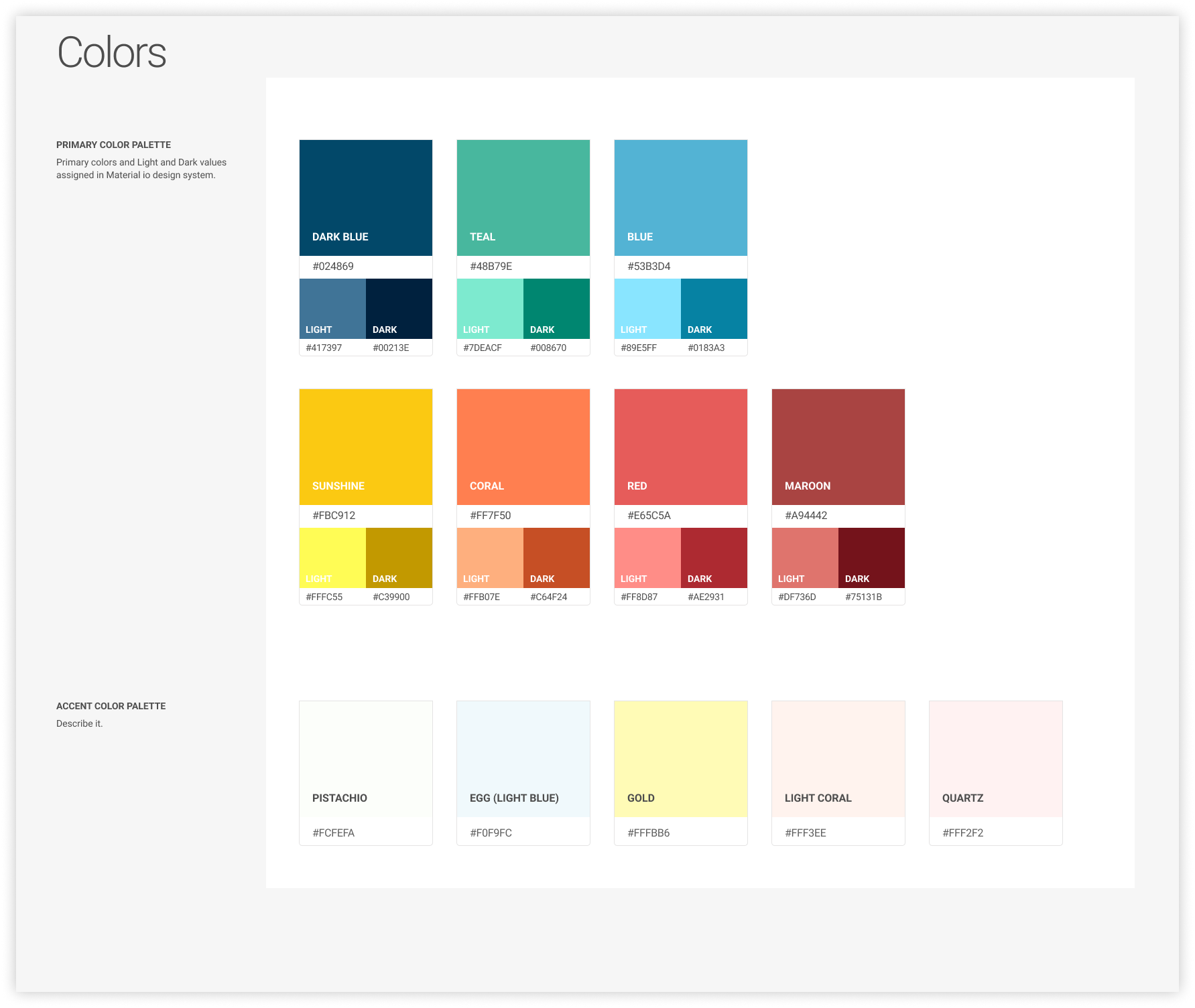
Legacy color palette
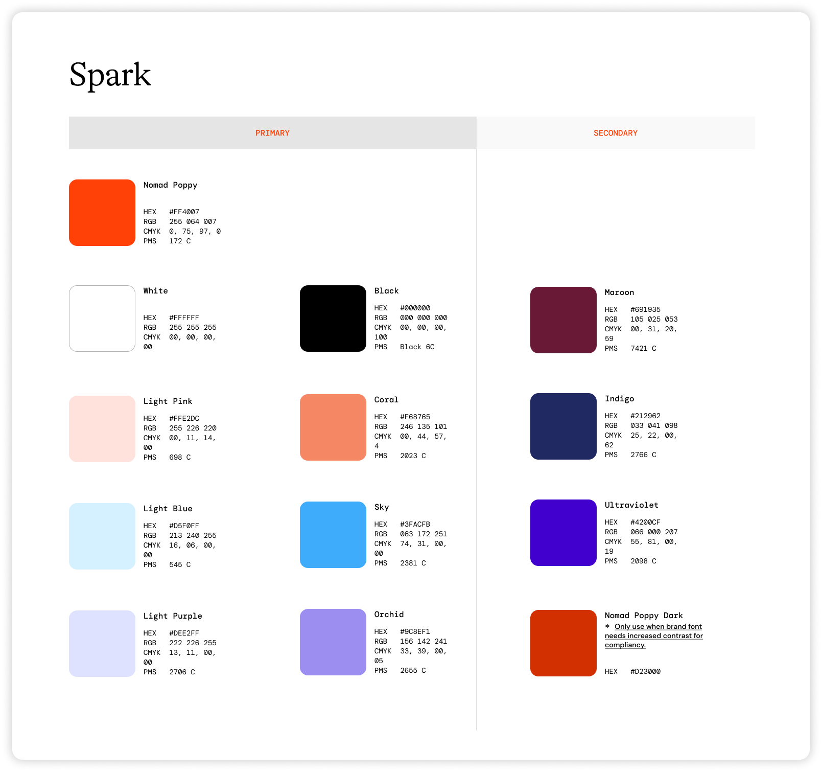
New "Spark" color palette
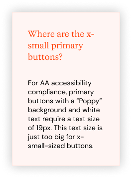
Moreover, the primary Poppy color was not accessible with against white at normal text sizes, but we needed to use it for our primary and text buttons. After much deliberation with Marketing, we decided on using Poppy Red as the background for our primary buttons, but only when using white text at 19px or larger to meet the “large text” threshold for AA Level compliance.
We also added a “Poppy Dark” color to the palette for simple text buttons and links that would typically appear at normal sizes against white backgrounds.

New "Poppy Dark" color

Poppy buttons with large white text and Poppy Dark text buttons for accessibility
Structuring the Library
With the new library, we wanted the structure to be intuitive and informative, so current designers could find what they needed and future new designers could be onboarded faster. Related components were grouped together, like form elements, which included Text Fields, Checkboxes, and Radio Buttons. We collaborated with the lead engineer to create naming conventions that would allow the Figma file stay in sync with the codebase.
We also tried to make elements as searchable as possible. For example, in our legacy design system, we had one Figma frame that all icons were dumped on with no real organization or labeling. To update our iconography, we replaced our in-use icons with equivalent ones from the Myicons icon pack. For each new icon, it was named with both the in-product function and the visual descriptor, so designers could search by either to find the correct icon.

Figma Components
In order to keep the components as versatile as possible, I leaned heavily on Figma’s variant properties. I consulted with designers to see which parts of components should be able to be toggled on or off or edited, then brought demos to a weekly design critique meeting to solicit feedback before embedding them into our design library.
I also embedded prototyping behavior between components with different states, so designers would have the prototype actions automatically built in. This can save so much time in the long run, especially when creating clickable prototypes for demos or for user testing.
Documentation
As design decisions were made, I included annotations and documentation about why we made the component the way it was, how the component should be used, and tips for implementing the component. It was important to keep a record of discussions we’d had and decisions we’d made as a group to avoid the dreaded question, “I don’t remember why we did this, do you?”
Annotation examples
Theming
Once we had all the major components added to the library, I turned to tackling the problem of theming. We had been exploring a potential new business line where we could host other travel nursing agencies’ jobs on a white-labeled site. The most straightforward way to create a mockup of a potential white-label solution would be to change each instance of our brand color and font to our theoretical partner’s branding. However, manually changing each and every instance would be extremely time-consuming and inefficient. Enter: design tokens.
I studied the way other large design systems leveraged design tokens, like Adobe Spectrum and Salesforce’s Lightning Design System. Based on those examples, I created a structure that would work for Nomad at a smaller scale.
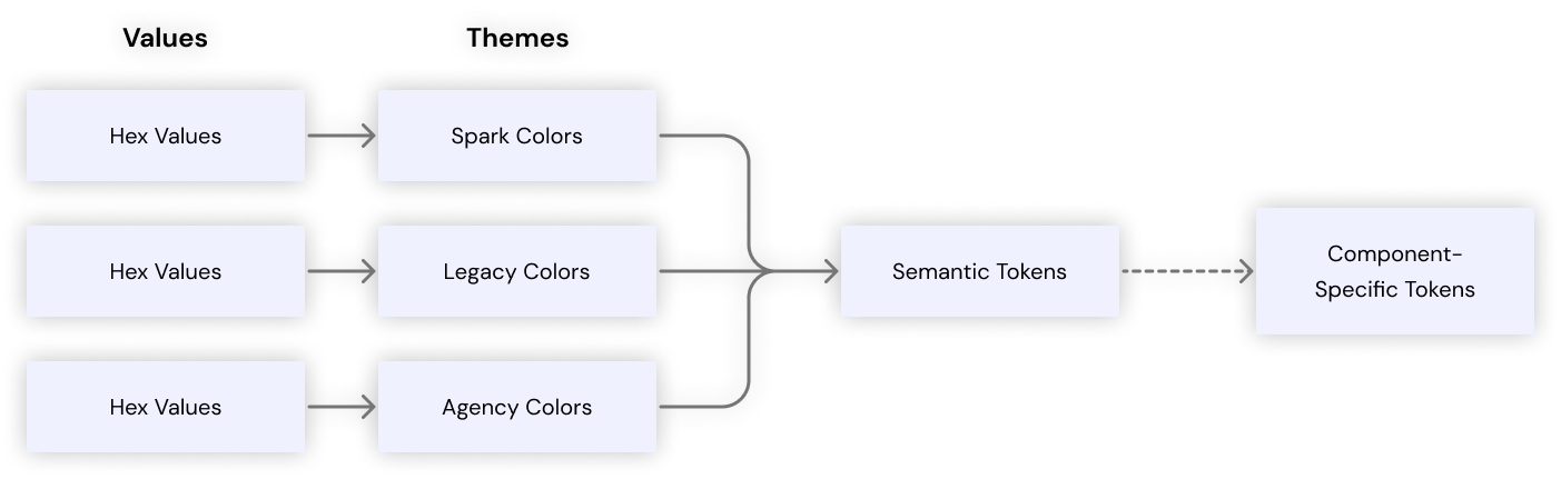
Thankfully, Figma had just introduced a beta feature called variables (not to be confused with variants) meant to address this exact issue. I collected every color we used across all the components and named them by color family and intensity (e.g. Red 100, Red 200, Red 300, etc.) for global tokens. I did this for our three main themes: our new “Spark” theme, our old “Legacy” theme, and a hypothetical “Agency” theme.

Then, I created a collection of “Semantic Tokens” that referenced only the global tokens from each theme collection, not hard-coded hex values.

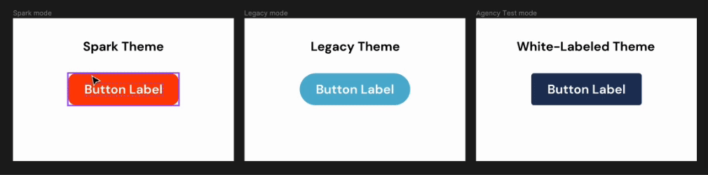
After linking these together and applying semantic tokens to each component, I was able to create wholly theme-able components. This meant going forward, designers could pull components from the design library and they’d be themed straight out of the box; all they’d have to do is set the theme at the mockup level.
Results & Takeaways
Despite the brand assets being delivered a month late, and only having one full-time engineer, one full-time senior design system manager, and one designer (myself), we managed to build a working design system in just six months. It was fully launched and being actively used by designers and engineers leading up to our September 2023 rebrand announcement, which rolled out smoothly with virtually no major issues.
We were also able to create a much better foundation for the future. On the design side, we had a robust set of versatile components with prototyping behavior and theming already built in. On the engineering side, we had a UI library that was usable across all our platforms, and changes were a breeze to implement.
“We have some REALLY smart components in Figma now.”
“This is a testament to how great design systems can be. One change from a designer flows seamlessly to the UI library and it updates everywhere immediately. 👨🍳😘👌”
Altogether, this was one of the most rewarding projects I’ve ever worked on because I grew so much over the course of it. Design systems require an exacting eye for detail, visual design skills, and technical skills, but the end result is well worth it when it results in untold saved hours in the prototyping, handoff, and development process.